Afterpay Brand Guidelines
Over the years our brand evolved into a mess of directions. Change of leadership, outsourced agencies and disjointed projects had pulled our brand in every direction. We'd lost our soul.
The challenge: bring back the attitude and personality in our visual language while keeping our brand core tight and consistent.
We partnered with Gretel in NYC to redefine the feeling of our brand—how we show up, how we speak, what we stand for. The result: solid foundations and a dynamic system that works across everything we do.
Creative Direction
Credit:
Agency: Gretel NYC
Producer: Sheena Dembry
ECD: Luke Martin
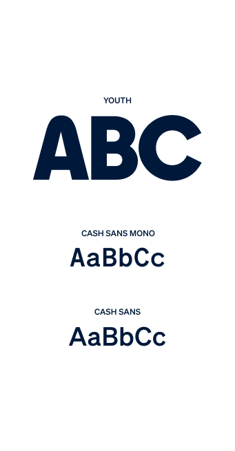
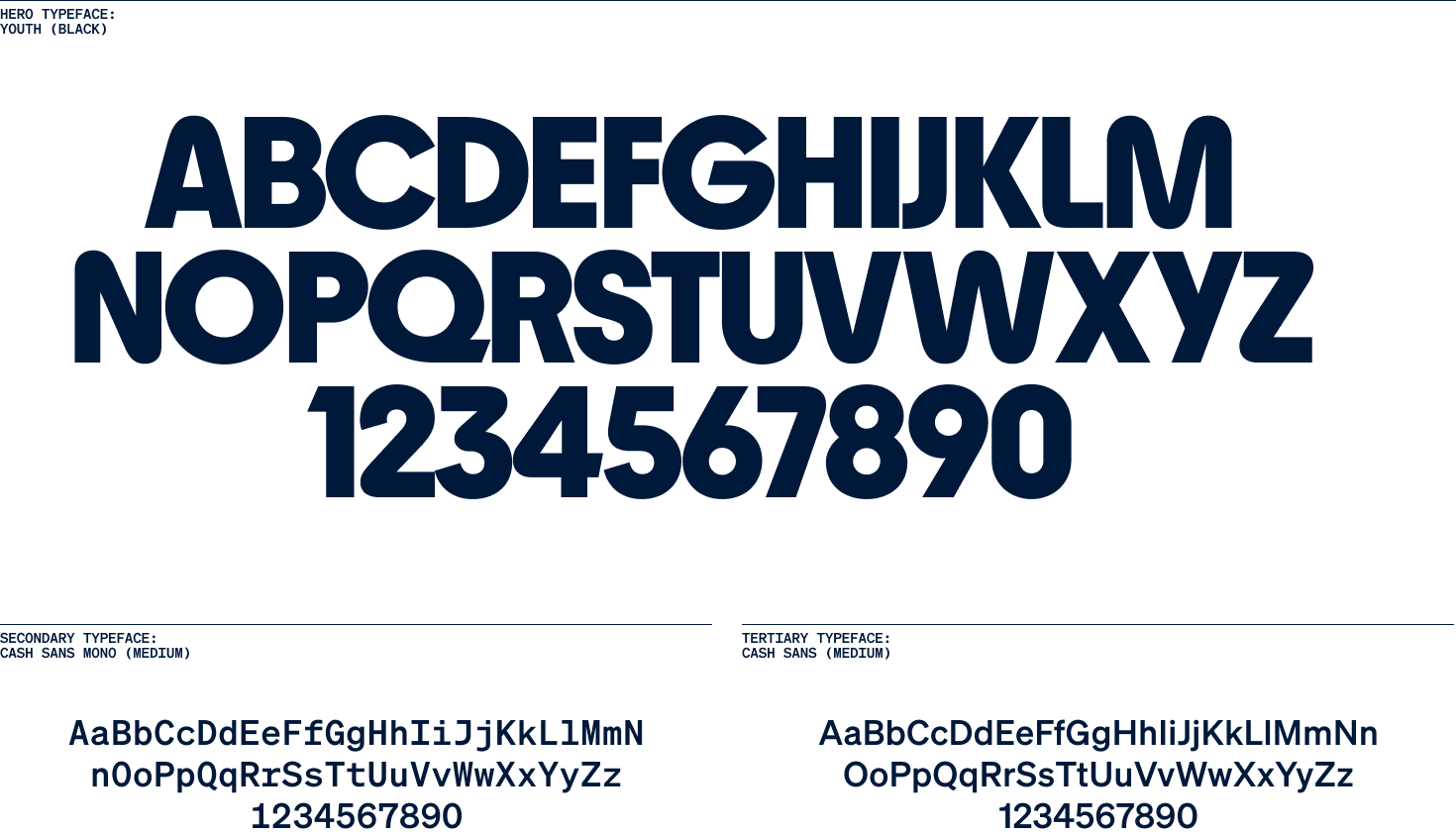
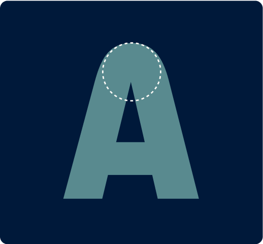
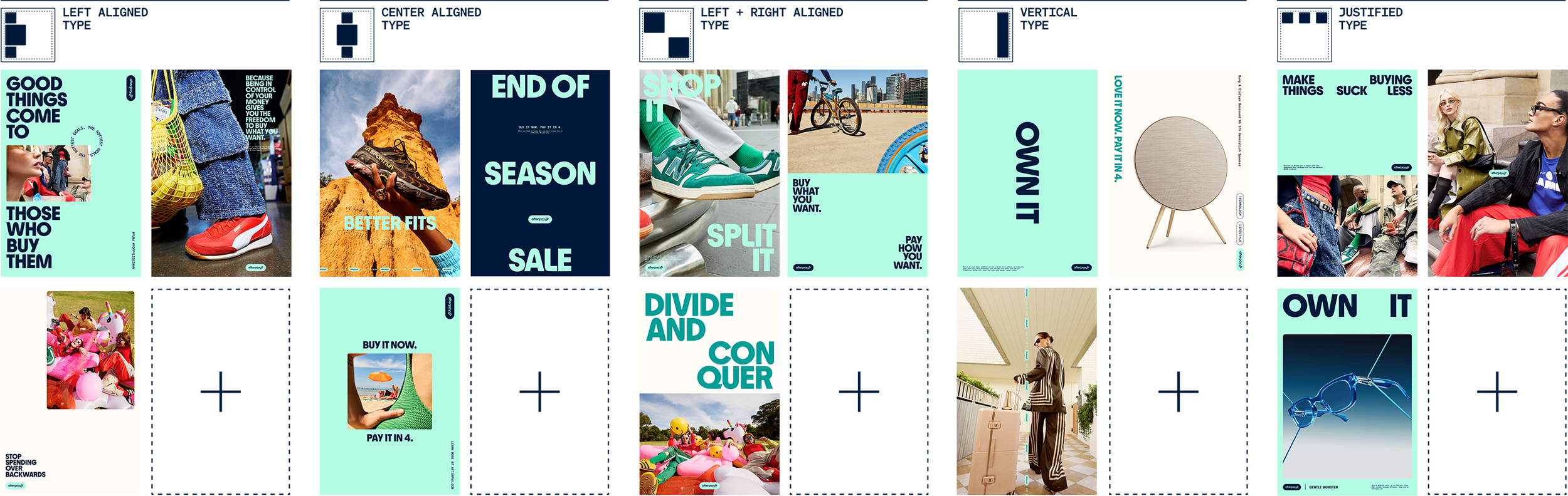
Type
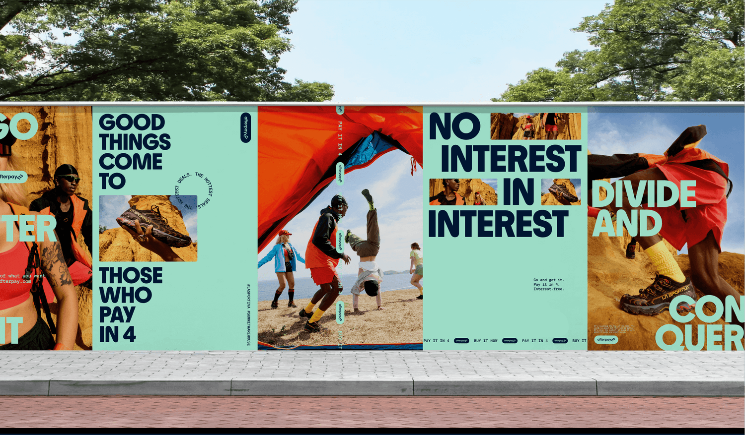
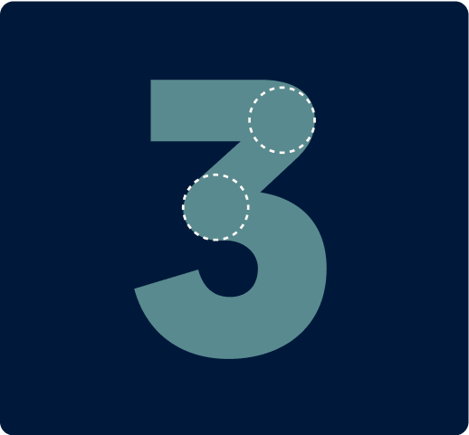
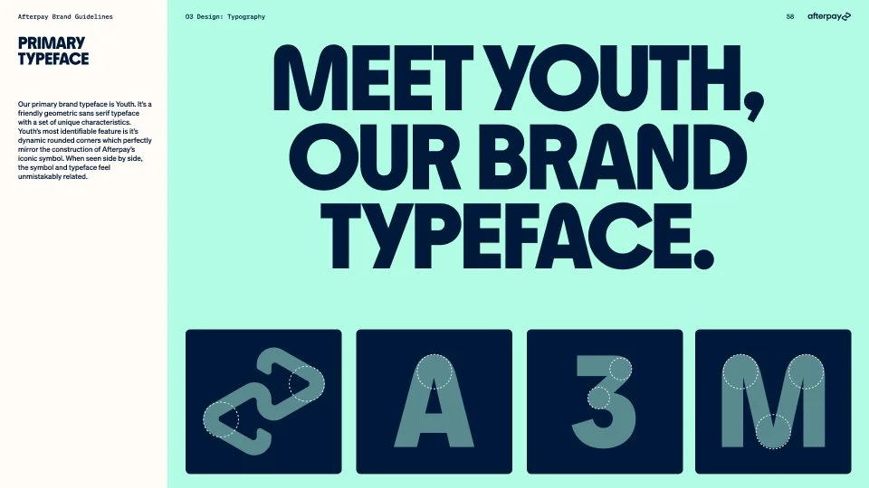
Afterpay Youth is the hero typeface. It's half Bauhaus, half modern - a timeless construction that shares the same foundational DNA as the brand mark and wordmark.
Colour
Stripped back colour system to support and hero the primary colour while allowing ownership of a more limited palette. Navy was introduced as a softer alternative to black.

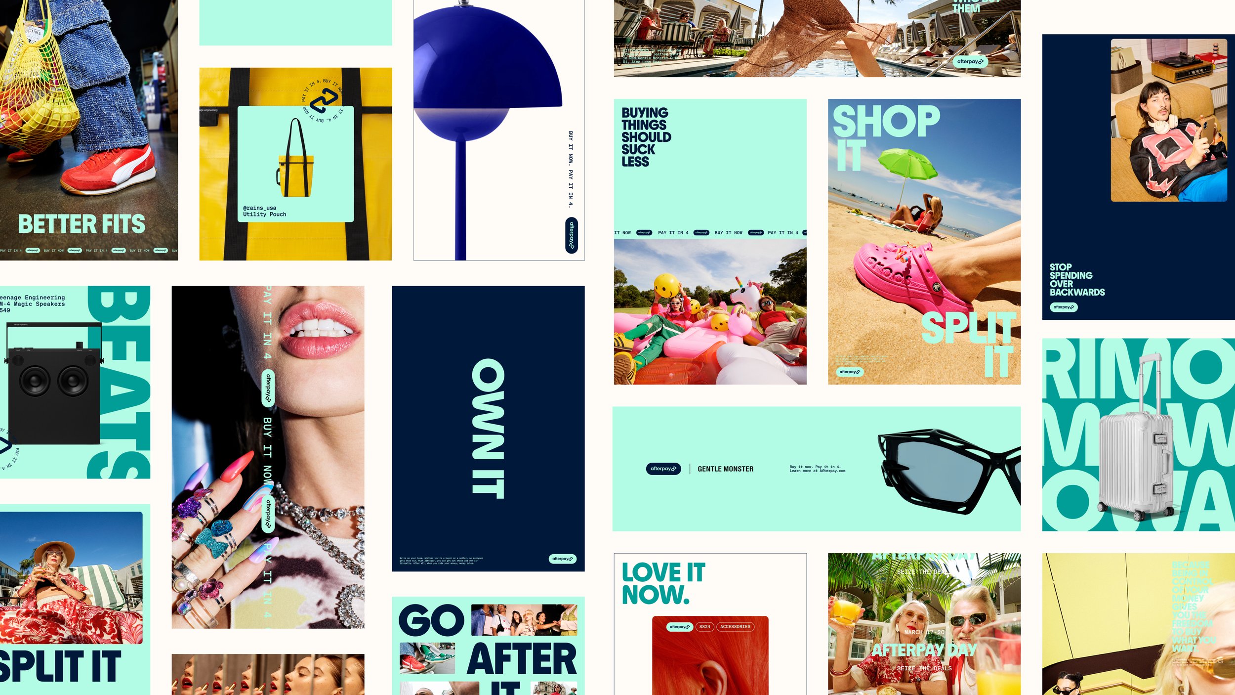
Texture
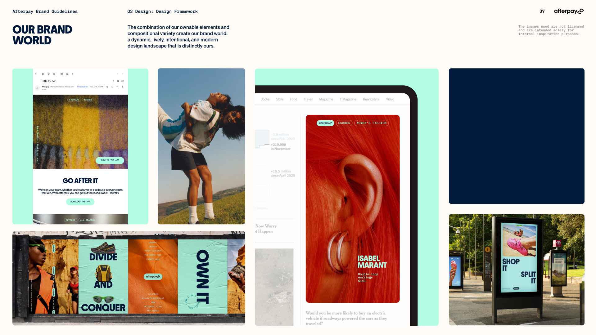
Graphic devices that add dynamic range to layouts. They keep focus on primary elements while bringing in details that add value in subtle, intentional ways.
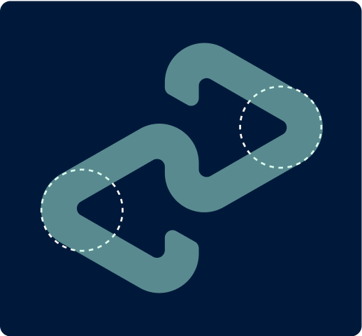
Icons
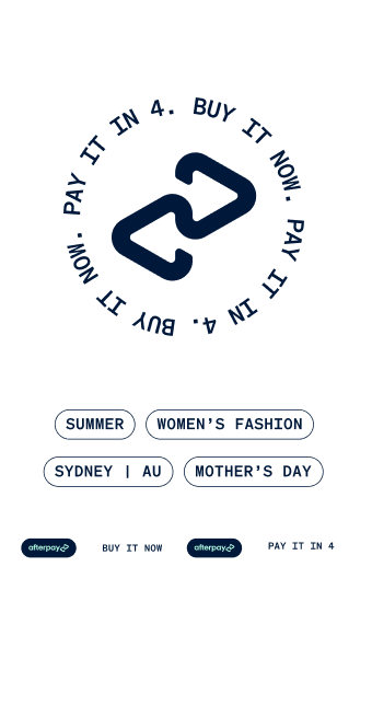
Iconography is born of the same foundational DNA as our logo mark, the Afterpay ‘loop’. Consistent by design.
Art direction
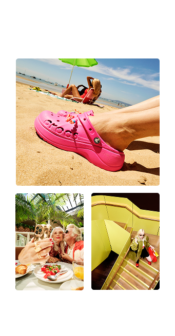
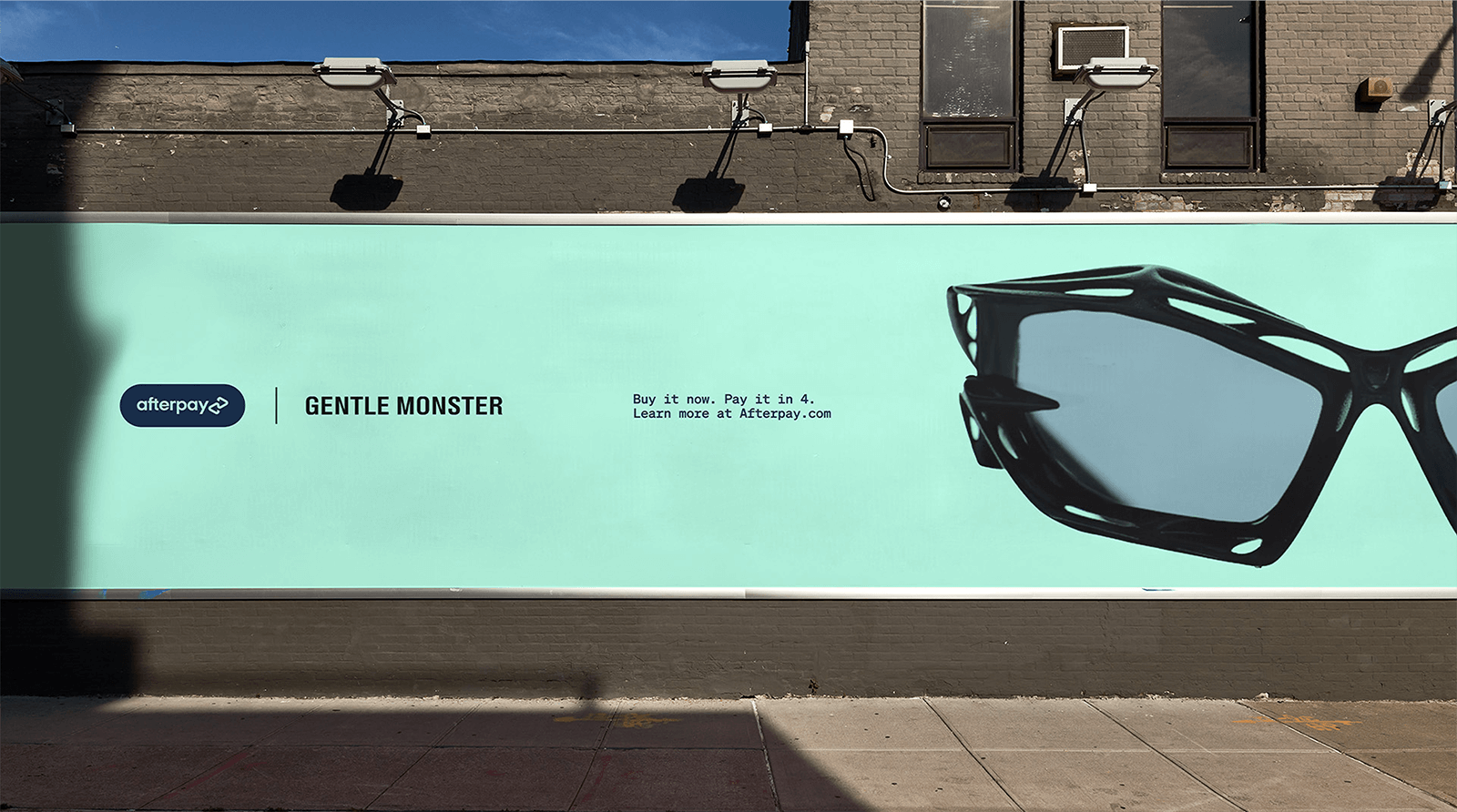
Photography styles that capture the values; time, freedom, authentic. while positioning us as premium and "In the Know." Also youthful in spirit, not in age.
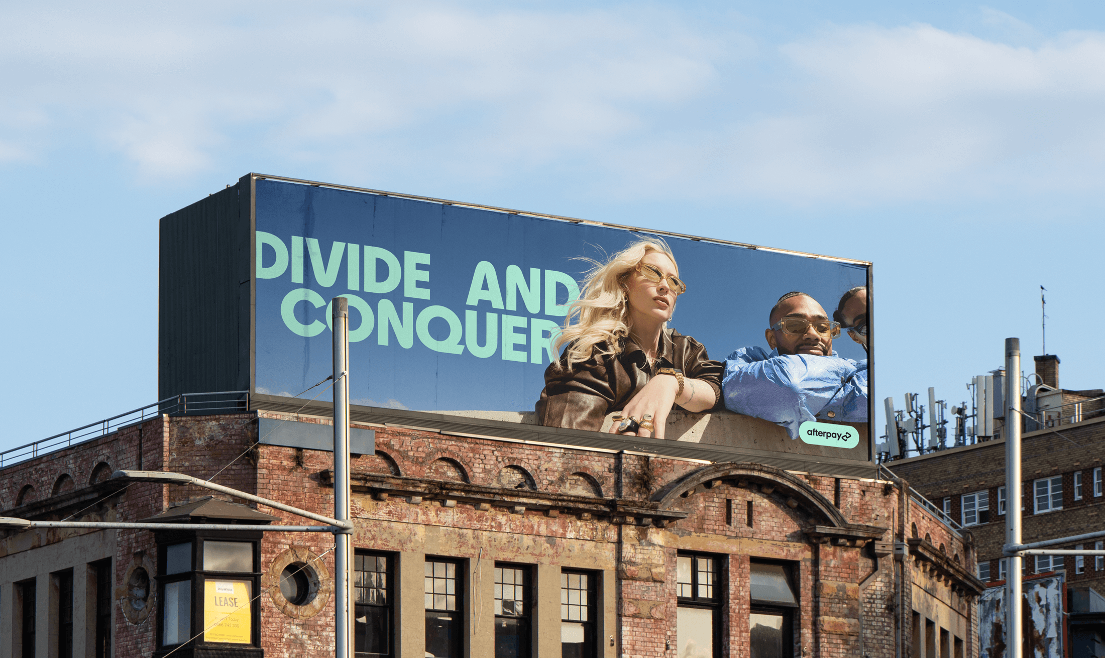
A bold, own-able and instantly recognisable hero typeface - paired with supporting, more emotionless fonts.
This design system was created to have a wide dynamic range. A strong foundational core with flexibility to whisper or shout.
Selected pages
More projects
-
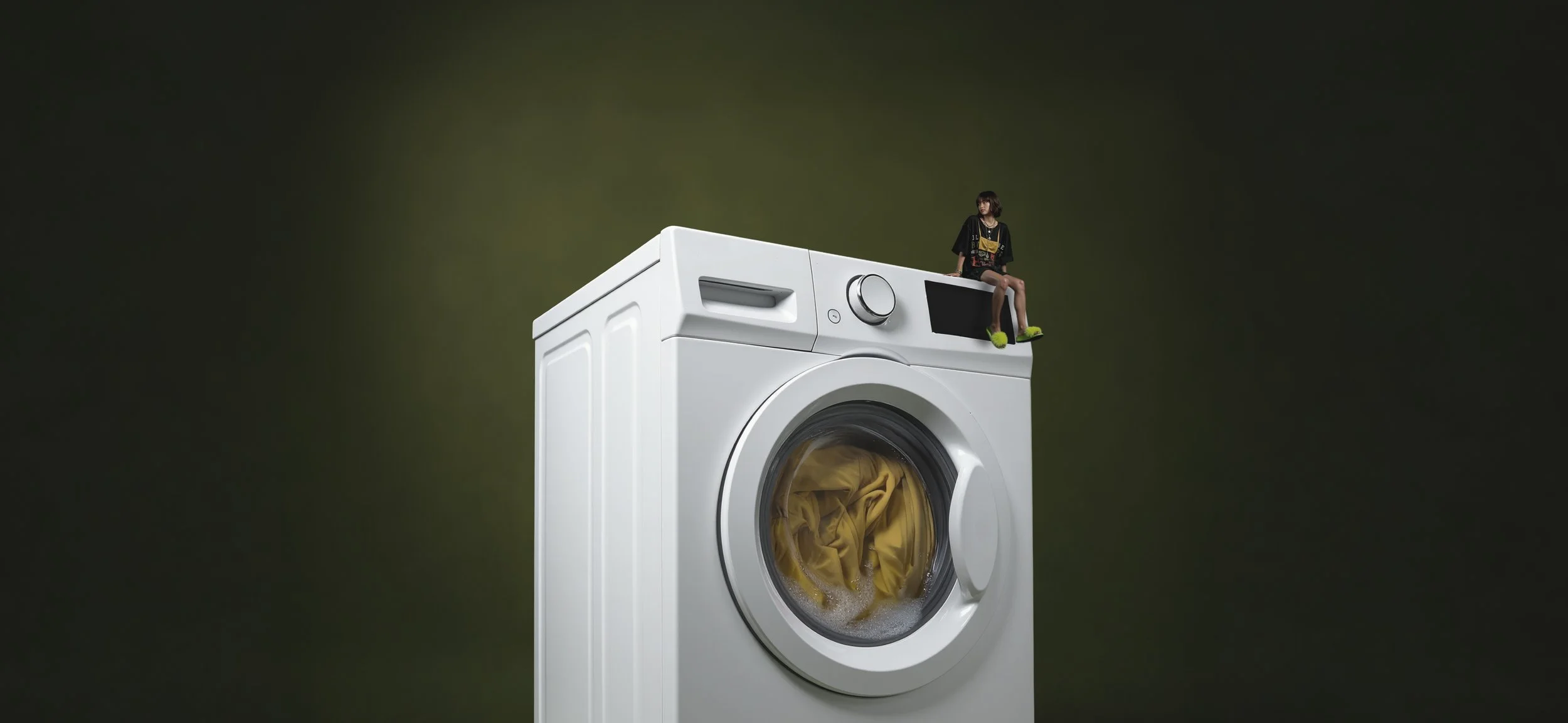
![A large washing machine with a small girl sitting on top of it. The washing machine is white, and the girl is dressed in black with bright green shoes, sitting on the edge of the machine's control panel against a dark background.]()
EOFY
-
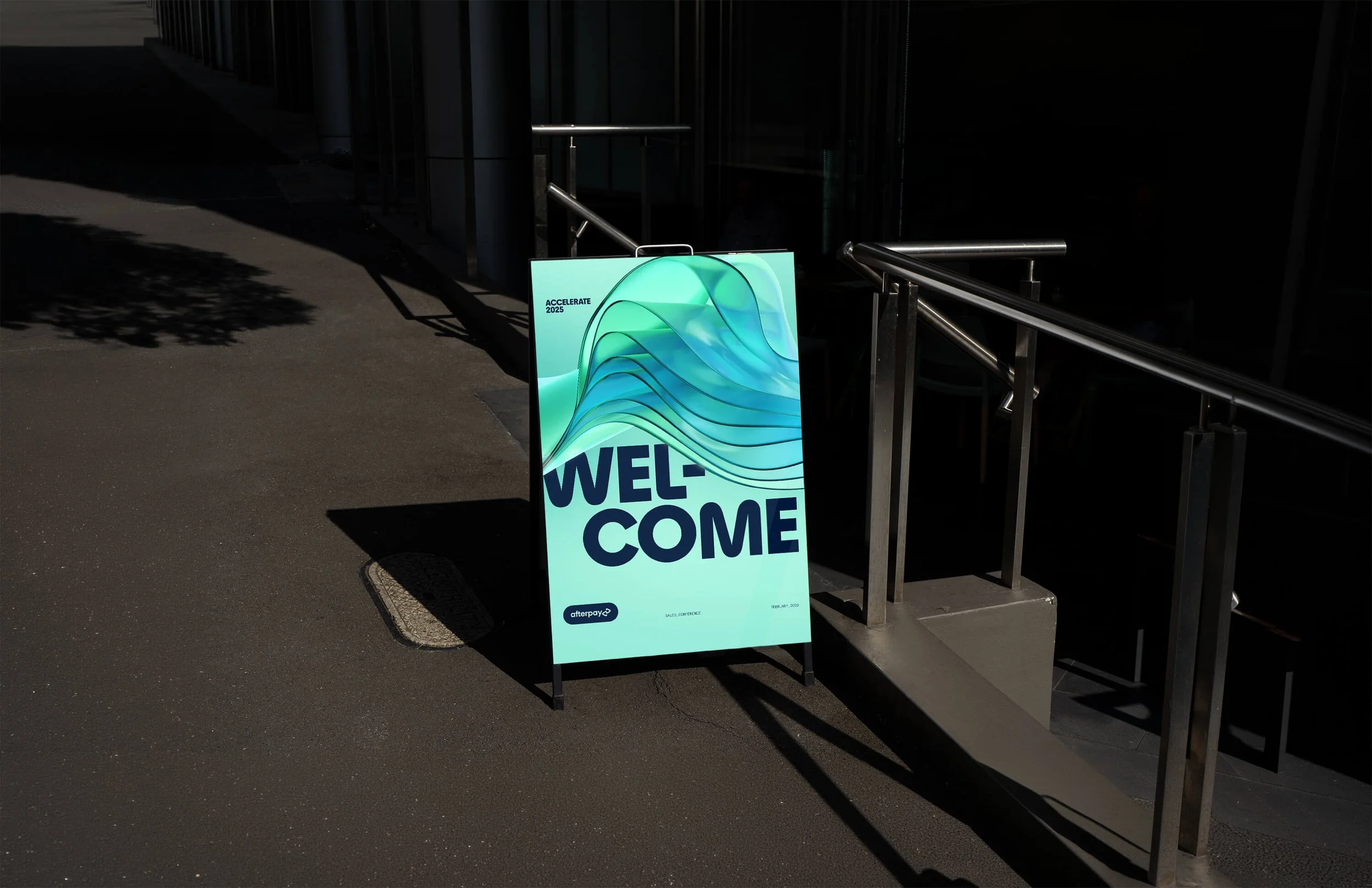
![Outdoor welcome sign with a colorful abstract design, reading 'WELCOME' in bold letters, situated near a staircase and railing.]()
Accelerate Conference
-
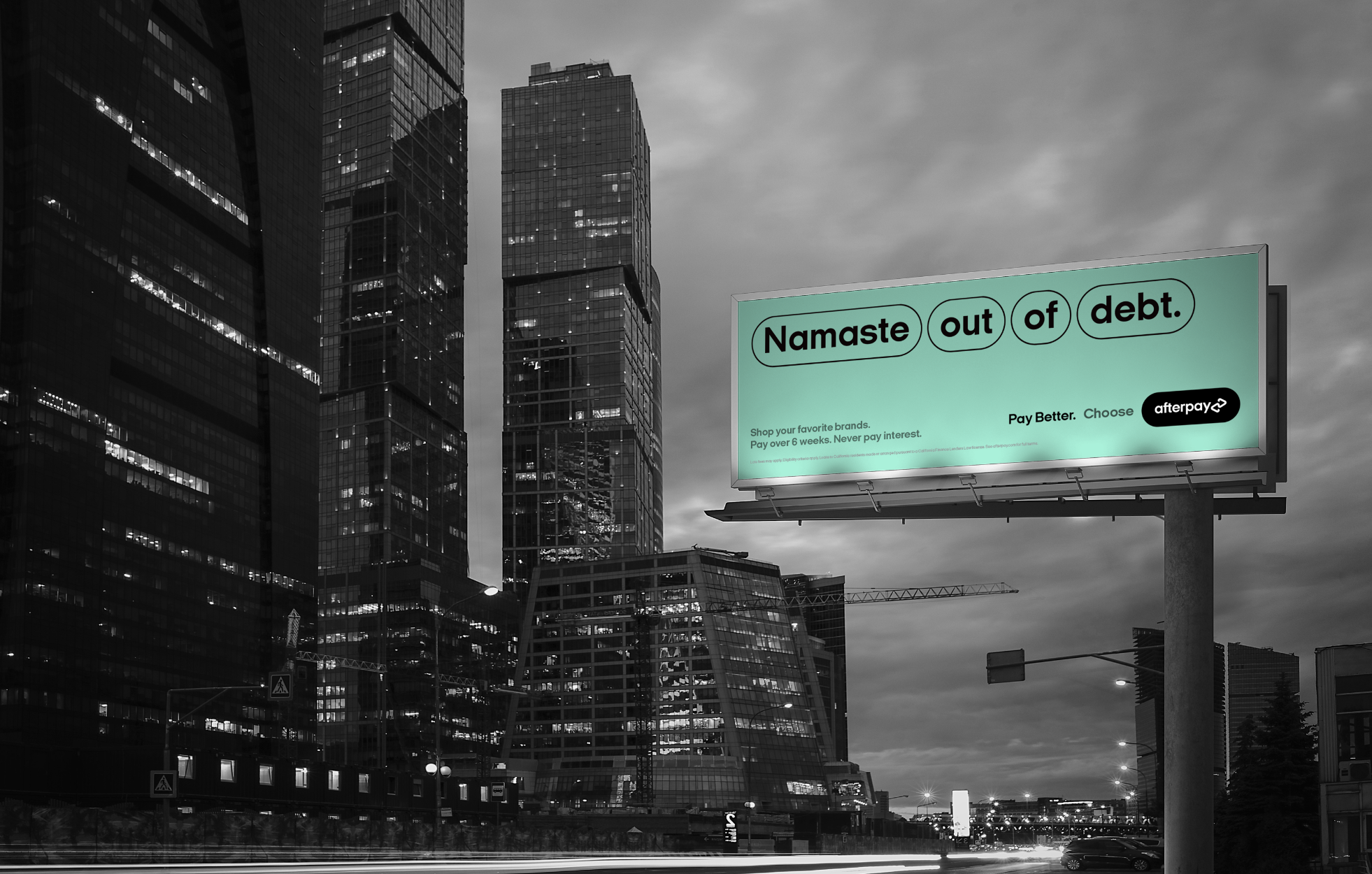
![A billboard displays the text 'Namaste out of debt' against a city skyline in black and white. The billboard has a green background with the words 'Namaste', 'out', 'of', and 'debt' enclosed in oval shapes. Additional smaller text promotes shopping and payment options.]()
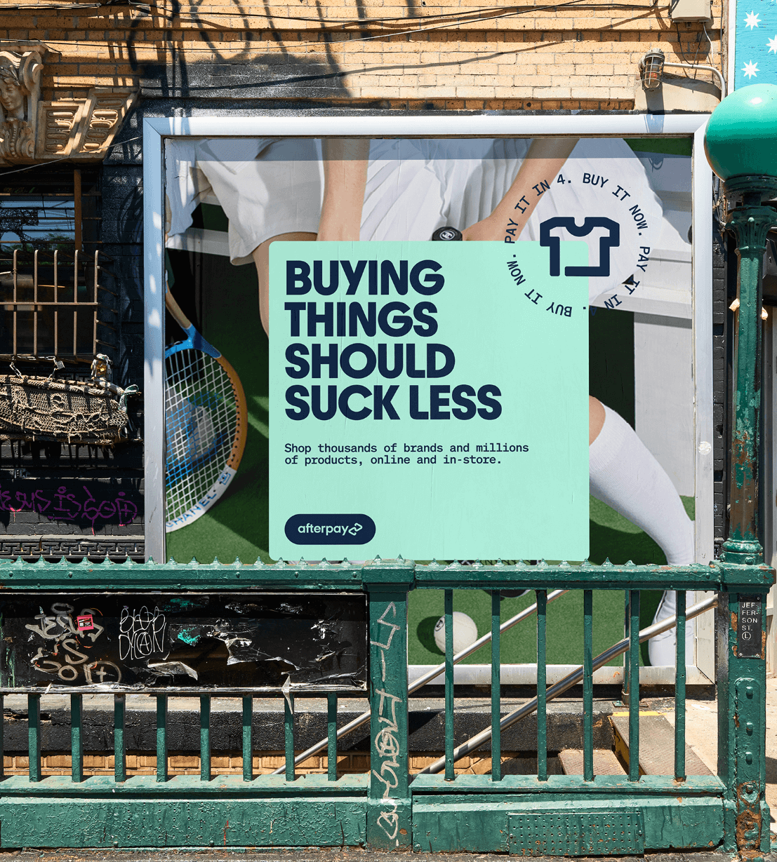
Pay Better Campaign
-
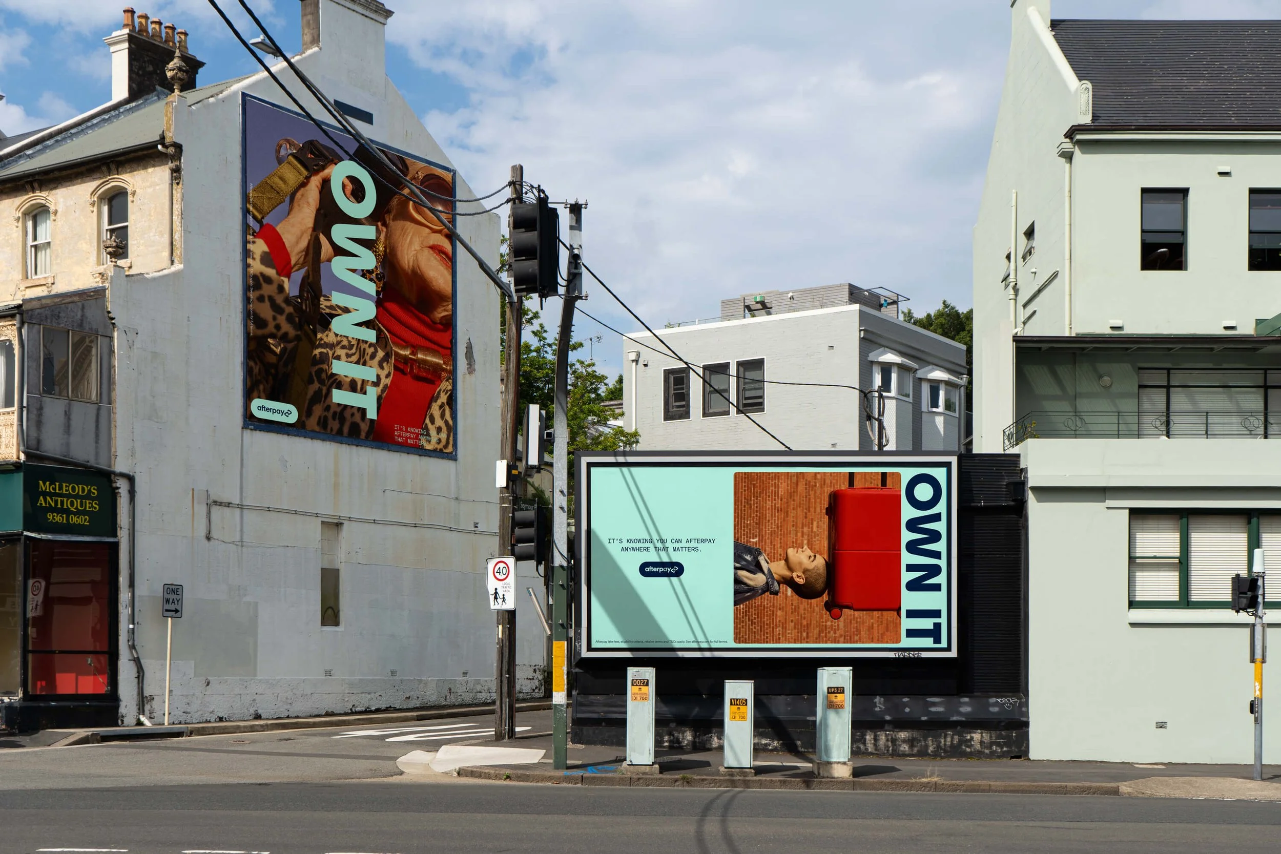
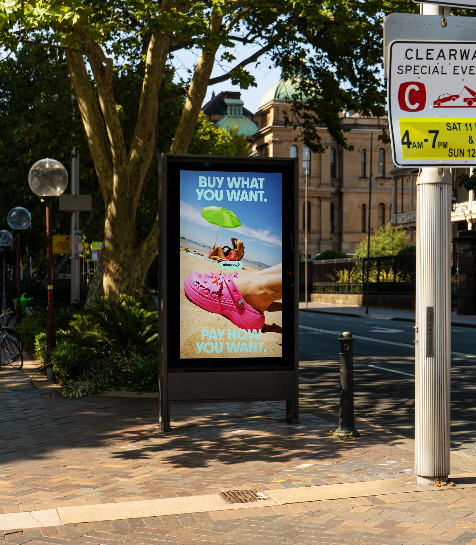
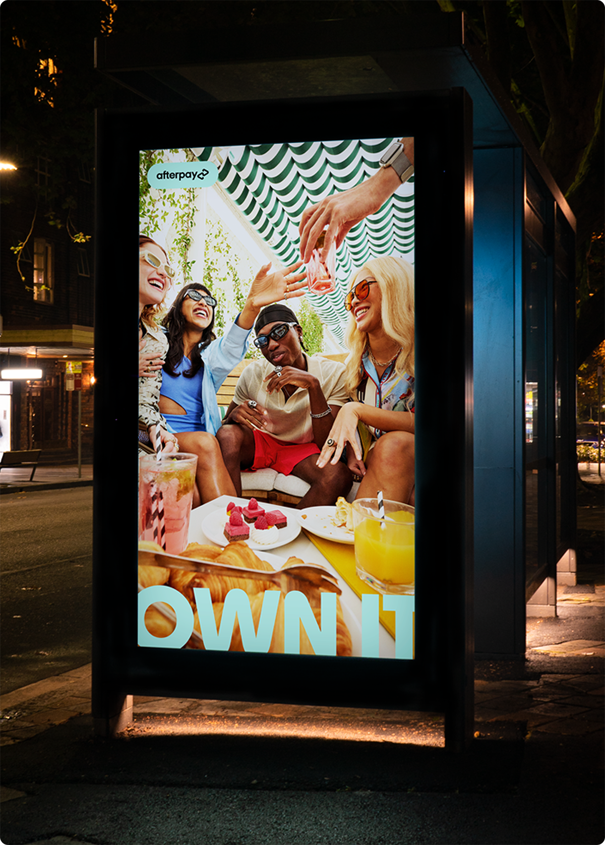
![Street scene with two billboards, one showing an elderly woman with red lipstick wearing leopard print coat and red turtleneck, the other with a person lying on their back on a red suitcase on a wooden floor, and a slogan about therapy.]()
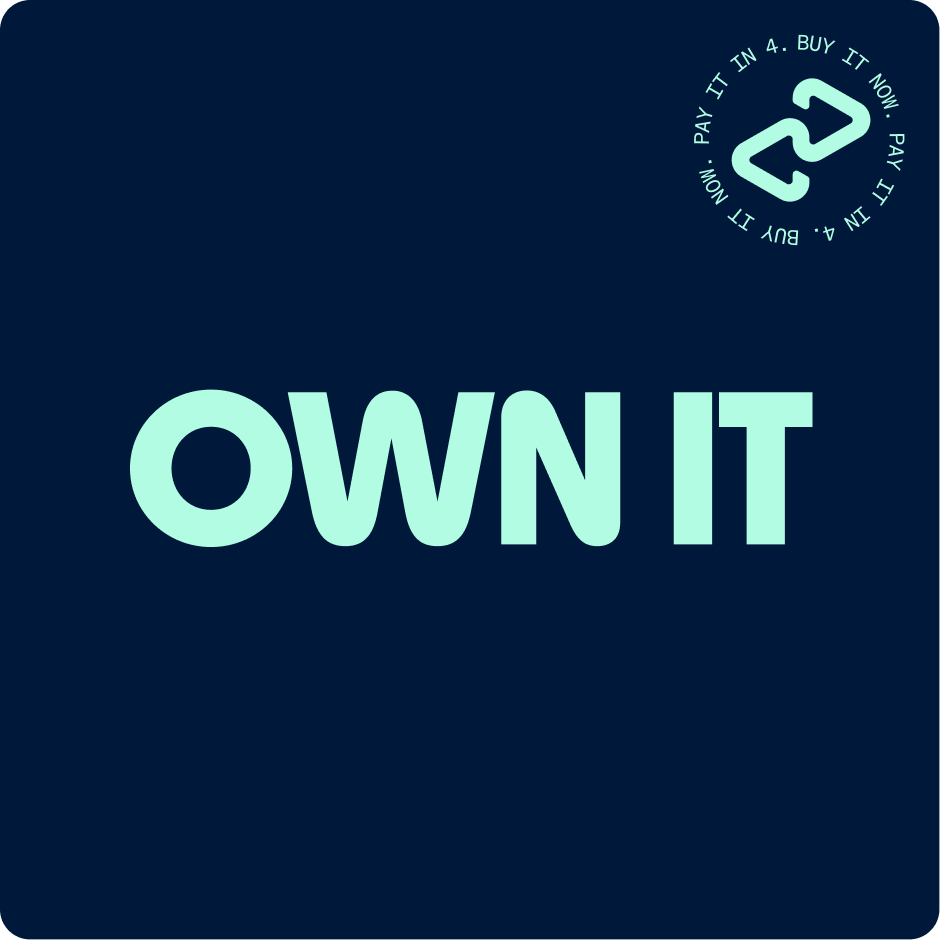
Own It Campaign
-
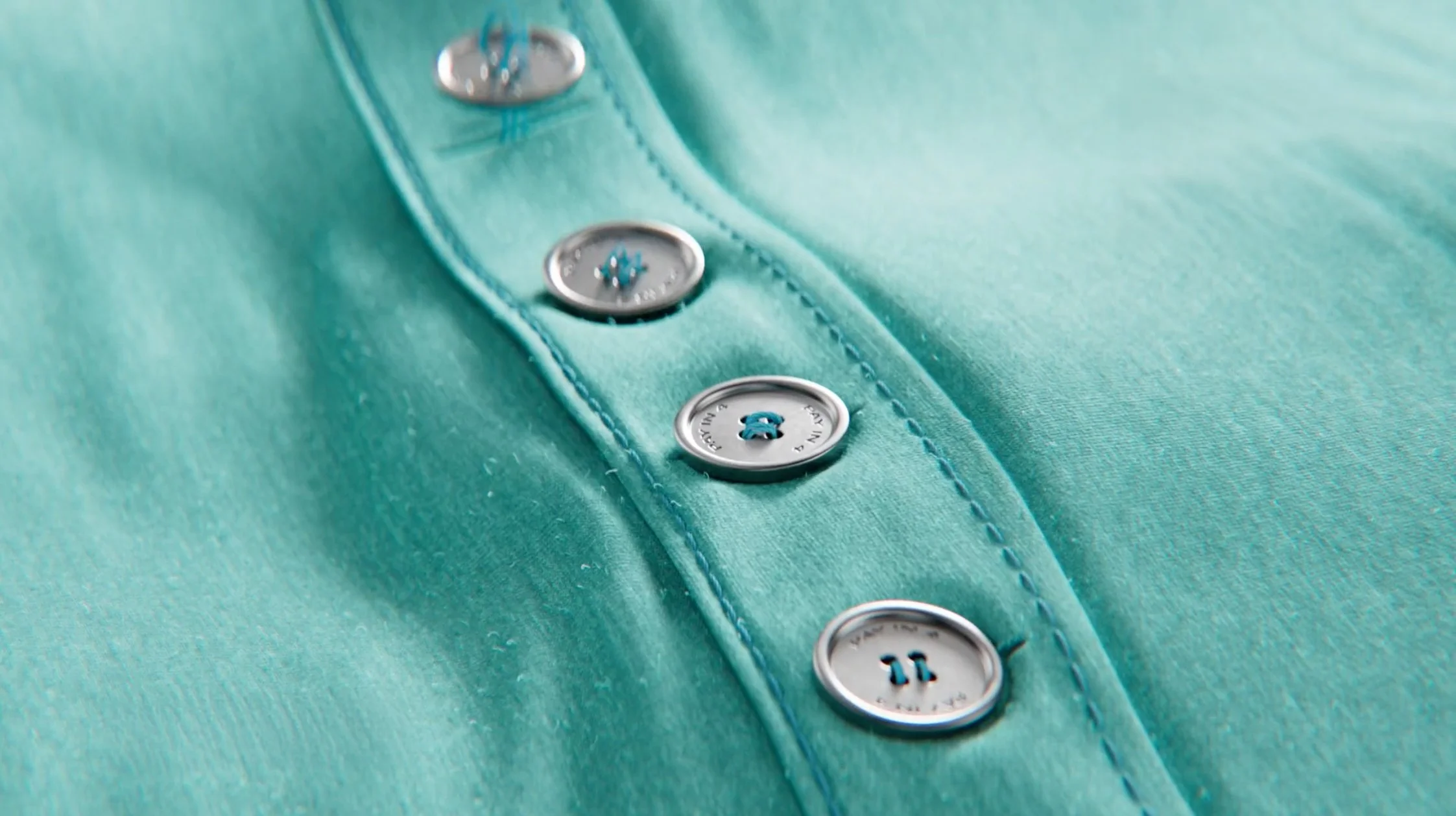
![Close-up of turquoise shirt with silver buttons down the front.]()
//ARCHIVE
-
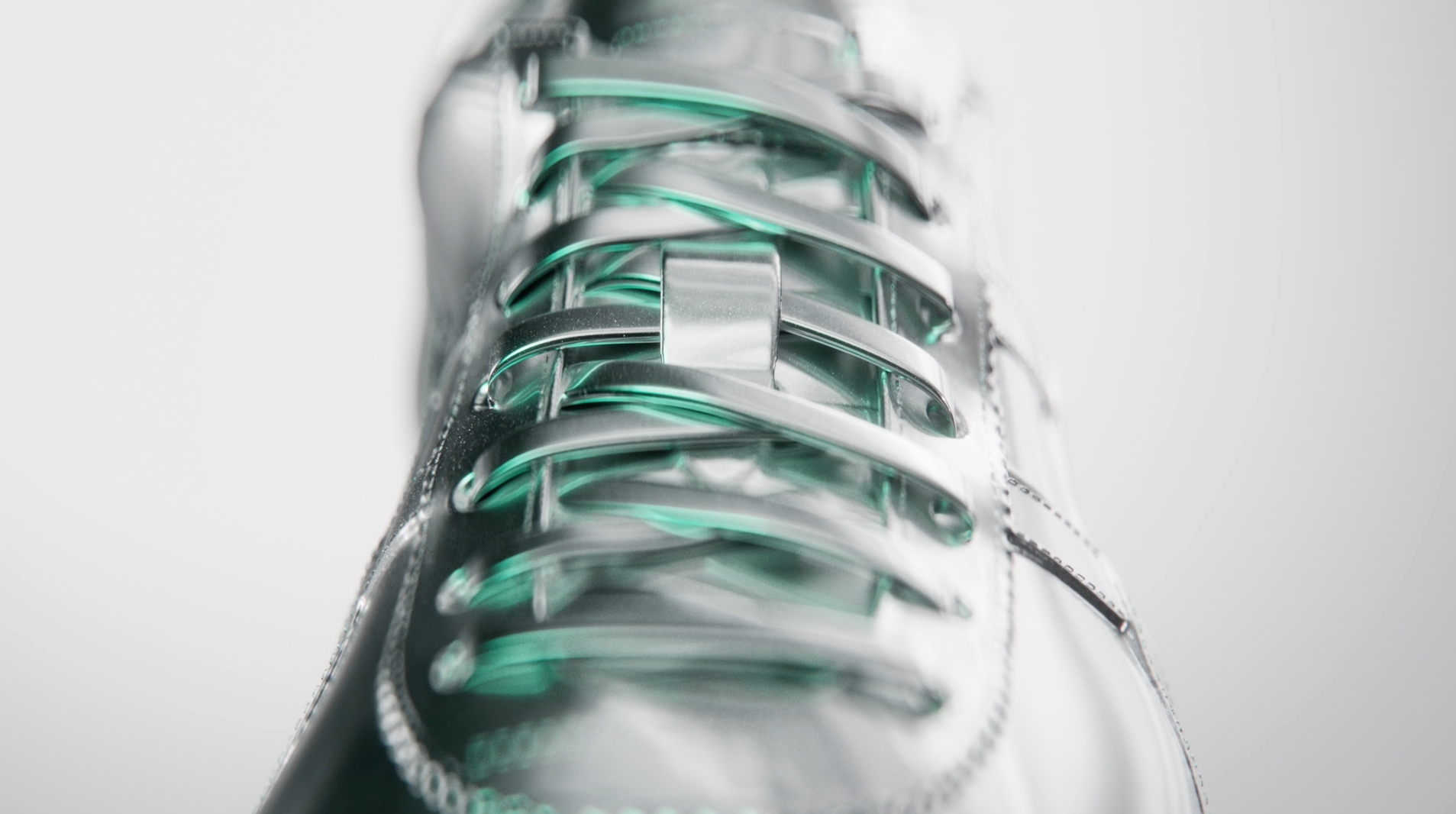
![Close-up of a transparent sneaker showing green and silver laces and sole design.]()
Afterpay Day
-
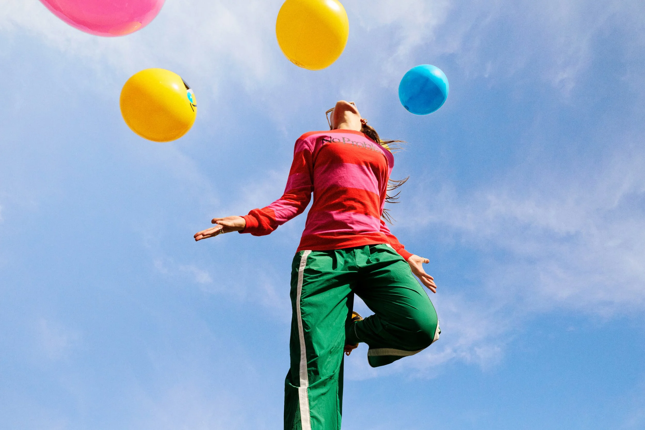
![Person balancing on one leg outdoors under a blue sky with colorful balloons floating above.]()
Brand Library
-
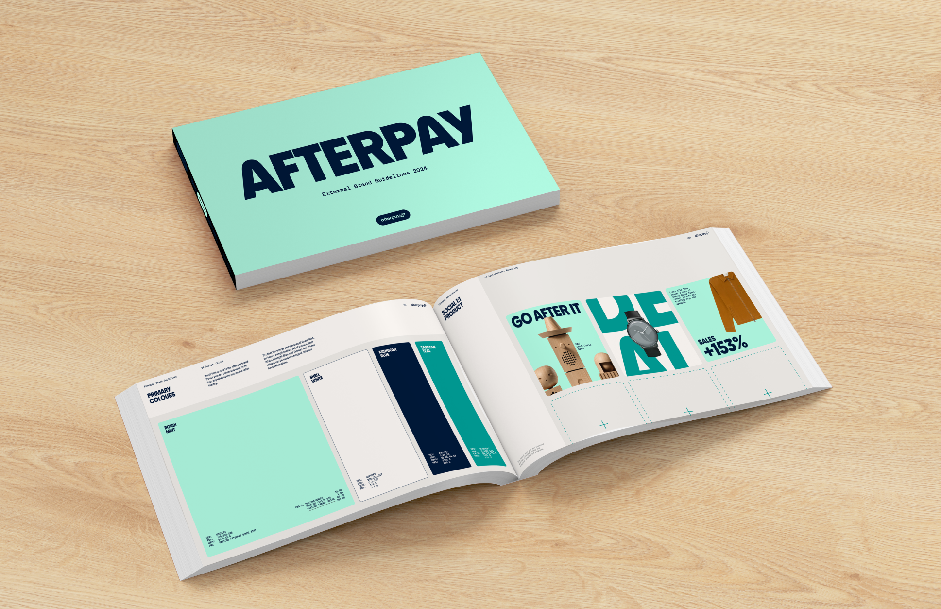
![Open brand guidelines booklet titled 'AFTERPAY' on a wooden table, showing pages with brand colors, product images, and promotional content.]()
Brand Guidelines